The best color for a kitchen?
Tile Transfers UK Best Colour Ideas That Work In A Kitchen
Many designs and styles – What to choose?
Where DO I start?
Ever had the feeling that you know you want to change your décor but you don’t know what you would like or what would suit your place? That feeling of uncertainty is more common than you might imagine.
Let me put your mind at rest about one of those problems. There is no such problem as ‘Will it suit my place?” This was brought home to me on a visit to a big old country house.
Story of the Big House
The house was one of those big 17th century mansions that was still in the original family’s possession. Nowadays, as it was too big to be of use for just one family, some of the rooms had been divided off to make separate private apartments, each with their own entrance.
The main part of the house still looked very 1800’s in the way it was decorated. It also housed the massive kitchen. I’ve been in many commercial kitchens that are smaller. Tiles up the walls to about shoulder height and the rest of it just whitewashed. Nothing fancy, everything in keeping with the style the family had maintained for this part of the house since it was built probably.
The Chintz Cottage
Within the same four outer walls of the house, on the ground floor of the North-West corner, was the first of the apartments I went into. The difference in décor was outstanding. The place had been modeled to represent a chintz cottage like you would find in an upmarket rural village. There was an oak beamed ceiling (fake of course), leaded light windows, soft green furnishings, cream and brown paintwork with floral patterned wallpaper. The china cabinet in the corner and the table set with bone china crockery completed the picture.
Standing in that room and looking out of the window, it was impossible to tell that I was still in the same house. Everything in those rooms suited the feel of the place.
The 60’s Apartment
The next apartment I went in was upstairs. Still within the same four walls but again that’s where the connection ended. First thing I noticed was the bicycle dumped in the small hallway. The stairway up to the apartment was painted pillar-box red with a white ceiling. The stair treads had white vinyl edgings to red vinyl tiles and a metal handrail.
The kitchen had white tiles and was painted yellow. There was a Formica topped kitchen table with tubular steel legs. Each bedroom was painted a single hard color. No patterns or pastels. Everything about the place screamed 1960’s, loud and garish. Was this really still within the same house? It certainly was.
Making it Their Own
There were other apartments; each had its own identity that had been formed by the décor and the furnishing placed in them. For me, this proved beyond doubt that it’s not down to what suits the place but is entirely down to what the tenant or owner makes of the place.
Keeping it Together
Although that true story established that it’s NOT down to what suits any particular building, it also showed that each unit, or room, within a place must conform to its own style to look really effective. The glaring red tiles of the 60’s apartment would have looked out of place in either of the other two sections of the house I talked about. Just as the soft greens or dark browns would not have suited the 60’s apartment.
For those of you who are thinking what to choose, this is a helpful start as it can show you what NOT to choose if you are just updating or renovating part of a room. Restricting what you should choose from can be a good thing, as it will help you to come to a decision sooner.
Coordinate Not Clash
Unfortunately, some people have no idea what looks good together, what doesn’t match and what clashes with other colors and designs. While getting the correct colors together can be done with the help of what I’m about to tell you, or by an Internet search of something like ‘how to match colors’, getting the design right can be as much personal choice as anything else.
For instance, you might have plain tiles on your wall. So you could either change the whole tiled section by putting different colored or patterned wall tile stickers over all of it, or just add a few patterned ones of a similar or contrasting color to make highlights. That’s four separate suggestions, all of which could be perfectly acceptable, with the ultimate choice being yours.
How to Research for Good Décor and Design
One of the best ways to learn what looks good and what doesn’t is to look at what colors and designs go together in showrooms where there are room settings. I’m talking furniture showrooms here as tile showrooms rarely do this kind of display.
Take note of how many different colors are used and if it’s shades of the same color that is making the display appealing to you or contrasts of color. Is it a plain effect with a patterned feature item or the other way around? You don’t have to go to showrooms of course. You can trawl through the Internet and magazines instead. The idea is to notice what appeals to you and why you think it works for you.
The other major thing to look for is what kind of patterns there are. Although anything is possible, it is not usual to mix different types of pattern in the same room. Stripes, checks, floral, swirls and arty graphics are just some pattern types. Again, just notice what appeals and what designers of the styles you like use and mix together along with the plain contrasting finishes.
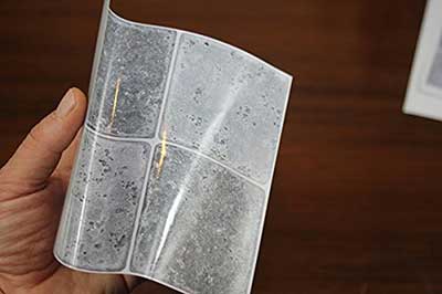
When it comes to using wall tile stickers to create a change of effect, here are some ideas of what is possible.
Click here for – Grey Vinyl Tile Decals
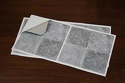
Click here for – Black and White Tile Stickers
![]()
Changing the appearance of your tiles using wall tile stickers.
- Cover with a plain sticker of a different color.
- Cover with a patterned tile sticker – can be similar or different color.
- Cover only some tiles with a patterned sticker to make highlights.
- Highlight tiles can be of a similar or contrasting color but are nearly always patterned.
- On plain tiles, cover randomly with different plain colors for a checkerboard effect.
- Use mosaic patterned tile stickers as a border.
- Use mosaic patterned tile stickers to create feature lines.
All those effects can be made with standard tile stickers used just as intended. You could also mix things up a bit by cutting them into random shapes or diamond shapes. Blue wavy lines in a bathroom is a favorite. Just depends on the look you want to achieve.
Learning more about color
While designers are aware of how to use color and the psychology of how to mix them to change moods and feelings, we the great buying public are not so consciously aware of how such things affect us. So I’ve been doing a bit of research on the subject on your behalf. I’m not going to go into serious depth here, just a lightweight sprinkling of general and, I hope, entertaining information.
Blue.
I often wondered why, even in days long gone, blue was such a popular color for a kitchen. Turns out that ceramic tiles were used in a lot of kitchens because they were easy to keep clean. Blue was such an easy color to add to ceramics they were used to break up the monotony of white tiles being everywhere while still costing about the same as the white tiles.
Blue is the favorite color of many people. Could be it’s because it is the color we associate with the sky and the sea, Giving the impression of a known environment it relaxes us, calms our nervous system and blood pressure. While it can be a cold color, think of ice blue, that’s the kind of environment we like where there’s food in a kitchen. In a shower room its representative of the water and cleanliness.
There is a strange optical quirk regarding the color blue. It can make objects seem farther away than they really are. Ideal for smaller rooms and tight corners. You will notice blue in a lot of workplace environments. Appearing in company logos and being their corporate color is no coincidence. Confidence, loyalty and trust are also feelings that the color generates. Ideal qualities a company would want to be associated with. Blue has very few negative associations and many tests have concluded that blue surroundings produced better productivity. No wonder it was used a lot in kitchens then.
Green
Green is the color that the eye sees as the most restful. We are able to notice far more shades of green than any other color. This is a biological fact that is thought to be due to our outdoor ancestry.
This is the color of nature. A sign of growth, the first sign of spring along with warmer weather. Green gives feelings of freshness, fertility, optimism and good luck.
Healthy living and being ecologically friendly is associated with the color green. Then again, so is money. In so many different countries too. Probably because its seen as trustworthy and calming.
Standard greens are best for kitchens while the more bluey shades of green suit bathrooms. The yellowy greens are best avoided for decorative purposes. They can look and feel a bit sickly. Some shades of green are associated with tradition and high class. It’s often better to use lighter greens as background colors and the darker greens to highlight features.
Gray
Click here for – Grey Vinyl Tile Decals
Gray, the color of brushed steel so commonly found in kitchens. It also contrasts well with polished stainless steel and chrome. Given the right shades of gray, a place can feel elegant, clean. Subtle stability demanding respect and reverence. A color you have to be careful with when it comes to blending other colors in a room. It can enhance softer shades of other colors but it’s not wise to put anything hard against it except perhaps black or white.
Ever watched those property tv shows where they often comment on how nice and light the rooms are? That should tell you NOT to use dark gray as a background, only as a highlighting or contrasting shade. In fact, some of the most elegant kitchens only use different shades of gray to obtain that classy style.
Orange
We’ve said previously that there are fashions in property décor almost as much as there are fashions in clothing or cars. Orange is one of those colors that is not exactly currently favored fashion like it has been in past years. However, it is still around and makes an excellent highlight color when used carefully.
One of the main reasons for its fall from grace may be because back in the 1970’s, when orange was all the rage, the mood of the Western World was one of get-up-and-go optimism and orange is the color that generates that feeling better than any other color.
Now the mood of the Western World is not so optimistic after our recent financial problems orange has fallen from favor somewhat.
Orange is an action takers color. It is not coincidence that many websites have an orange ‘buy now’ button when they are asking you to take action.
If you want to bring elements of warmth, energy, vitality, enthusiasm and flamboyance to your room, add dashes of the color orange in there. Just don’t overdo it, that’s all.
Brown
Brown can be used to symbolize family security. Same color as the Earth, having a natural richness. Just like luxury chocolate, gourmet coffee – and beer! Think of the shops that have brown as their main theme color and how warm and welcoming they can feel.
It can make you feel calm with it’s natural rustic qualities. I’ve heard some people say they’d never paint their kitchens brown but then admit to having natural wood finishes for their kitchen furniture.
Mixing red and yellow together and then darkening it down to the shade or your taste is how we get those rich colors. This enables you get every shade from a light coffee color to a dark oak shade. The advantage here is that it can contrast or blend with a wide range of other colors and shades.
Red
Warning! Red Alert!
Your pulse is starting to go faster, so is your breathing rate. Your blood pressure is rising. These are proven psychological effects of the color red. Red generates emotions of urgent passion, excitement and drama. It also stimulates your appetite. Notice the corporate colors of McDonalds, Burger King, other fast food outlets and even some supermarkets.
There are other forms of excitement the color of blood generates. Think of the passion of St Valentine’s Day perhaps, with all those red hearts. Maybe a drive in your Ferrari. Watch out for that red fire truck though.
Of course, all this excitement can, and does, burn energy fast. So again, not too much red in your decor would be advisable. Shades of yellow and ochre are the colors it mixes well with as the aforementioned retail outlets demonstrate. In fact, using red as a highlight or point of focus color, may well be the best use of it. You don’t want to overdo the excitement do you?
Yellow
Nothing beats the color yellow when it comes to generating expansive feelings of cheerfulness and happiness. Whether it be from sunshine, golden blond hair or the sight of gold bullion, yellow gives us those nice warm feelings of joy.
A couple of strange facts about yellow is that, because of its wavelength, it’s the color our eyes process first but it’s also the color that our eyes find hardest to cope with. Go figure! It certainly attracts our attention the most. This might be something to do with Mother Nature again, here’s why:-
Putting the colors yellow and black next to each other often acts as a warning. There are dangerous snakes with black and yellow markings and so have stinging insects like bees and wasps. Traffic warning signs and hazardous chemical signs are also yellow and black because this color combination is so easily noticed.
Some folks are such lousy cooks that their kitchen décor definitely ought to be black and yellow. With red highlights. Then again, yellow makes people feel quite productive for short periods, so maybe not.
White
For pure freshness and clean looks, white is your color. However, it can also feel cold, bland and clinical. While it is technically a neutral color, if everything around you is white, it can cause eye strain and headaches. I even had to wear sunglasses while painting a white wall once.
One of the best things about white is that it provides a perfect compliment to just about every other color and is also a great background for many patterns and feature displays.
Black
Click here for Black Tile Stickers
![]()
The connotations of the color black are many and it’s up to the skill of the designer or the imagination of the viewer as to whether or not to use it was correct. It can be seen as the most elegant and classy color of all by many, while others take a negative view and think it’s only suitable for funerals and the dark arts.
Black and white are the only two colors we regard as opposites. Yet they so often complement each other when used in tasteful décor design. Both black and white can give enhancement to virtually every other color when used either to accentuate the other color or when the other color accentuates the black or white.
I’ve seen whole feature walls and backsplashes done with black tiles that look fantastic, but I’ve also seen some that look awful when in context with other surroundings. Black can make a powerful statement, but you must be careful how you use it. First do lots of research to find what you like and what you think looks good is my advice.
Click here for – Black and White Tile Stickers
![]()
Summary
This completes my short look at how color is perceived to affect us in general terms. I’ve only lightly touched the surface as the whole subject of color and color coordination is very big and complex. I’ve only described the basic colors and not even touched on such blends as pink, purple or violet or any particular use of the effects of shading.
We talked about how there is a fashion to home décor and that fashion styles come and go and how it can look wrong to mix them in the same room. That it is the décor of the rooms rather than the type of building they are in that creates the image of a place.
I also advised you to take notice of what is considered fashionable at present. Even within that, a style can be modern, traditional, functional or quirky. It all depends on what you like to make a place ’yours’, even if it is a rented property.
Taking notice of what designers think goes together and what styles you like is the best advice I can give you. Looking through webpages at photos of homes for sale is not always a good idea. Some of those owners have no idea what looks good or what looks garish or out of fashion.
Here you find more kitchen revamp ideas if you need some inspiration.
More interested articles: Kitchen Revamp Ideas, Tile Stickers Good or Bad? Vinyl Flooring? Glass Splashback?